True stories: Marco Panzerini’s favourite Cinelli graphics

Marco Panzerini is Cinelli’s art director.
He has been designing graphics for Cinelli bicycles since shortly after arriving the company in 2012.
His favourite graphic he ever designed for Cinelli is – obviously – the new Cinelli Pressure team edition.
Why?
“Because the thing I like the most is work with graphic or painting processes and this artwork is all about process. And even better is a process that has never been used before in cycling. I got the idea from another sport that is very close to my heart: windsurfing. In windsurfing certain brands will paint their freestyle boards only with primer to keep things light and then lightly sand it to allude to the artisanal process of hand-shaping the board, which is not visible in the final product. What I’m so excited and happy about is that I took this process, which is something almost “secondary” in another product and transformed into the center of attention, and did it before anyone else!”
His choices are surprising, fascinating, and a whirlwind tour through our more recent history!
Marco’s top 3 Cinelli graphics designed by HIM
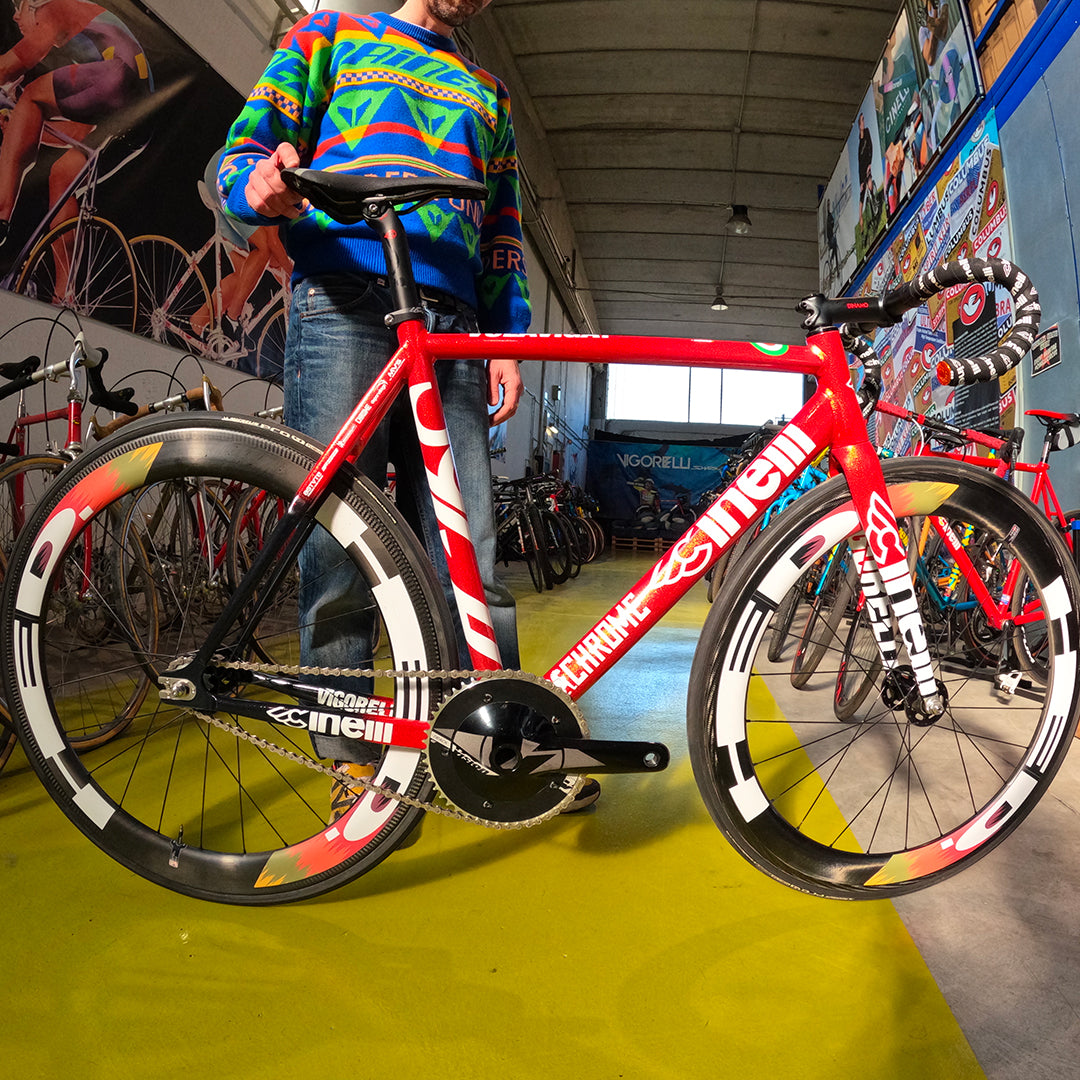
Cinelli Vigorelli RHC edition
“At first this was meant to be a one-off bike for our team leader at the Red Hook Criterium that year, Davide Vigano, but then we got so many comments that we made a small production run. Again, like with the Pressure what I love here is the great process! The glitter flakes were bought in America from Roth Metal Flake, the brand created by hot rod legend Big Daddy Ed Roth. The flakes are so chunky that it took 8 layers of clear coat to get a smooth finish. Then after that, applying the graphics was easy: I just went for a super team, super bold effect more like motoGP bike than a bicycle.”
Cinelli Vigorelli 2015
“Here the idea was all based around an asymmetric graphic placement. The Vigorelli and Cinelli logos and painting masks were asymmetrically placed across top and down tubes creating a strange rhythm and visual surprises. Also: I thought the brand would never approve it because it was probably the first time ever, or at least in many years, that there was no Cinelli logo on the downtube (non-drive side…).”
Cinelli Zydeco 2018
“I designed the graphics for the first raw aluminium Zydeco frame in 2015/16. It was my favourite graphic and of course I bought one. Then in 2018 I made this graphic (and sold my 2016 Zydeco and bought this one to replace it!). It’s my favourite of the raw Aluminium Zydeco graphics that we did for many years just for the way the graphics blend into the aluminium. It was the first time I used the colours from our “Caleido” graphic concept – which we used on a lot of bikes in those years – OUTSIDE of the Cinelli logo. In general these raw aluminium frames caused loads of production problems but customers loved them!”
Marco’s Top 3 Cinelli graphics NOT designed by him
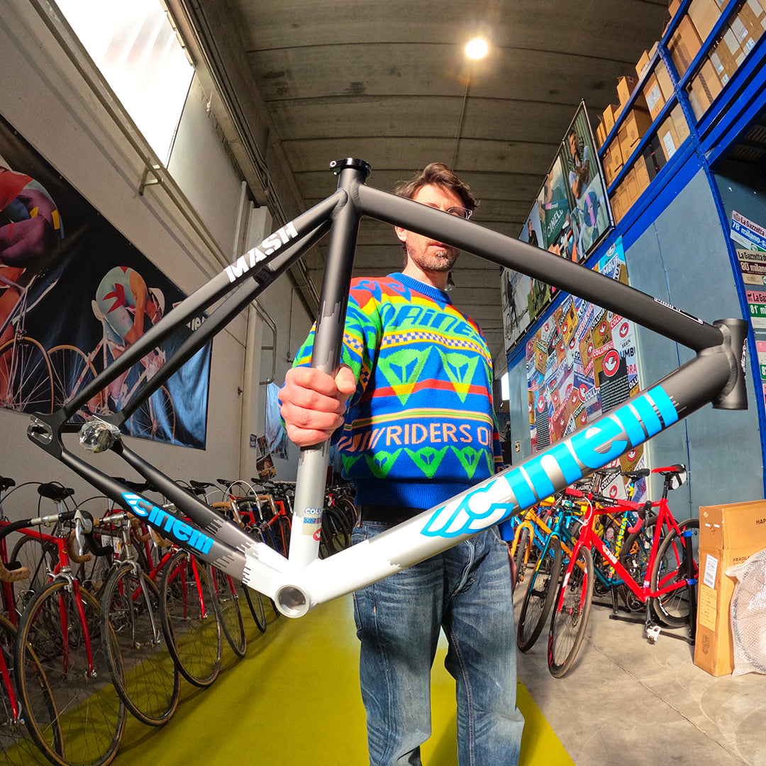
Cinelli Mash Histogram
“There are so many Cinelli-Mash graphics that I love but this for me is the revolutionary one and the one which became the basis of many of the graphics we later made with them. And again it’s a graphic/process from another world (in this case photography), recontextualized on a bike. Also fun fact: I bought this bike with my very first ever Cinelli paycheck!”
Cinelli Passatore
“Apart from really liking these graphics, in particular the head tube badge – which we have incorporated into some special 75th anniversary items this year which I can’t wait to share – what I think is so cool about this bike is the historical reference to the Italian brigand, the Passatore, who was an extremely violent and borderline figure in national folklore… Risky, fun stuff and a really great bike in general.”
Cinelli Strato Caleido
“I think it was the first bike that Cinelli used the Caleido concept, which I really like and inspired some of my own graphics for the brand. The Caleido concept is derived from the effect created when colours are mis-aligned in the four-colour process, revealing cyan, magenta, yellow and black. I don’t know the full story behind how this graphic was borne but I can’t help but suspect that it was inspired by the seminal work of the Milanese graphic design legend Giancarlo Iliprandi, colleague of Italo Lupi, who designed our winged-C logo in 1979…”